We were given a word and were asked to explore it through Typography. Visually, the word should not need interpretaion but speak for itself.
My word: Success


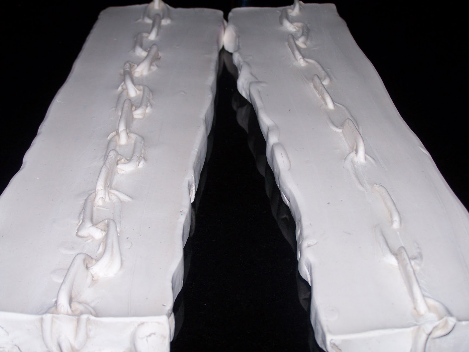
 |
| Gold chain link |

Diamond
Week 2
Continuing with the same word, express it visually.
 |
| Gold Bullion, engraved with lettering "Success" |
 |
| Sweet Success |
  |
| "Success" on a plate We were asked to find something at home that represented our word - sorry it was joggled around a bit! |